Press releases are usually all about writing. However, a different - design focused - approach sheds light on some game-changing aspects. It can seriously improve your press release efficiency.
When you notice all press release design decisions you (often unconsciously) make, you'll definitely upgrade your workflow. Add press release templates to the mix, and expect to save hours and achieve better results!
Don't worry: it doesn't have to be an out-of-the-box, creative press release design. Oftentimes, the simplest solutions are the best.
Let's cover the crucial factors of a press release design:
- eye-catching headline
- layout and formatting
- multimedia
- press release branding
- mobile optimization
- accessibility
Each part brings you tips on how to improve your press release templates' design.
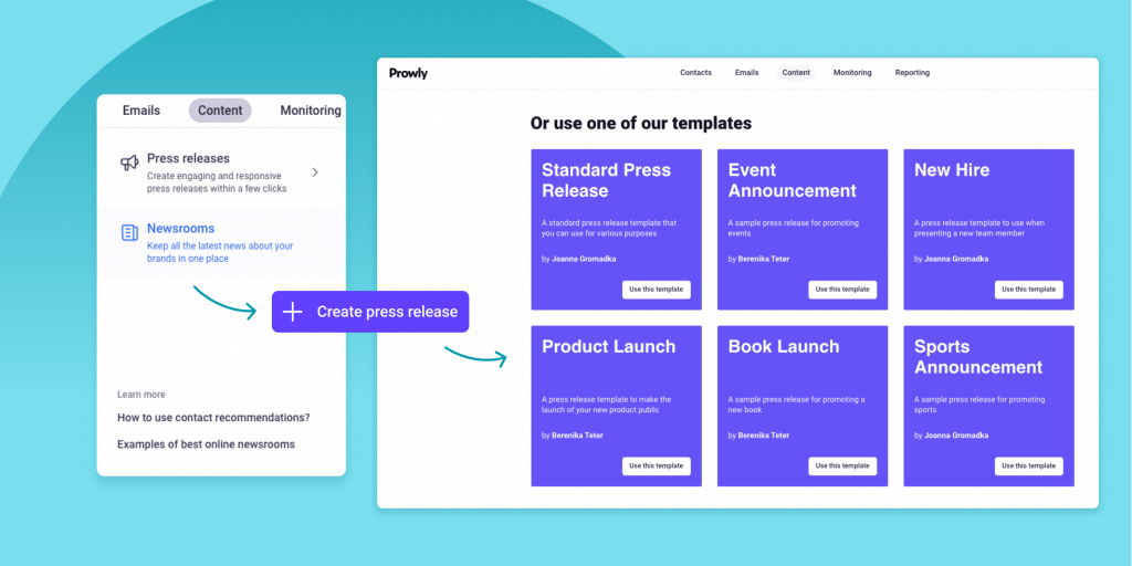
If templates stole your attention, jump straight ahead to Prowly's customizable Press Release Templates database.
Crucial factors of a press release design
Paying attention to the design doesn't mean you need to come up with a unique press release every time you share news. What's more - these tips will work perfectly in upgrading each press release template you have and bring you better results fast!
Let's talk through each design element from our list. You'll also find specific, press release template-related tips!
Eye-catching headline
Usually, when we talk about press release headlines, it's all about words and getting the right idea through. And that's a huge topic - we even published a guide on how to write a great press release headline.
Yet, once the words are on point, the visual design enters the scene. And it helps you hook journalists. Even the smartest headline won't work if it's not noticeable, right?
To make your press release headline visible, you can use several means:
- colors and contrast
- different fonts and styling
- visible separation from other press release elements
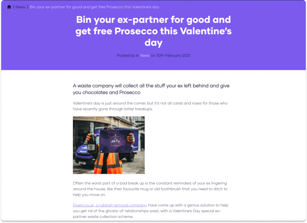
Let's analyze an example from Divert.co.uk - a rubbish removal company that launched a special Valentine's Day-themed trash removal service. In short, if you call them to collect the stuff your ex left behind, you'll get chocolates and a bottle of Prosecco.
Their smart headline (and brilliant marketing idea) put on a colorful background to stand out from the rest of their press release. With color choice, styling (the huge font in bold) and separation, it's just impossible to skip.
👉For your press release template: Not sure how to make your headline stand out? Seek clues in your branding information.
Layout and formatting
Even though the press release structure is pretty rigid, there's still space for design decisions when it comes to layout and formatting.
The most important rule? Match your audience's needs - even among journalists, they can differ from one industry to another.
Let's take a look at an unobvious example - a sports press release coming from the Mercedes-AMG Petronas Formula One Team after securing a podium in the 2023 Australian Grand Prix.
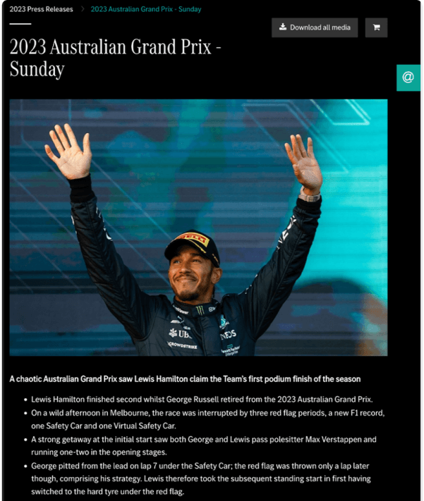
As soon as you read through the press release, you'll notice a different choice of structure. The Mercedes team's PR department opted for:
- a quick recap of the race in bullet points
- a clear table with team results
- a few high-quality photos for editorial use
- and statements from the athletes and engineering team
There are no long paragraphs nor lengthy intros because sports journalists need succinct, transparent news. Also, the quotes are carefully phrased. Each sentence makes a tweet in itself, letting the speaker's personality shine through.
It's a perfect example of design decisions and each of them works for the press release target group: sports journalists.
👉For your press release template: If you deal with different target groups, create a tailored press release template for each of them.
Multimedia
With online press releases, you can share so much more than just text and images - use this potential. A press release that's full of multimedia content grants more possibilities to journalists to create an engaging story. Naturally, it gets more attention.
Think about multimedia when crafting the press release design. Infographics, videos, or photos can tell a part of the story and provide richer context.
In terms of multimedia-rich press release design, LEGO definitely hits the sweet spot.
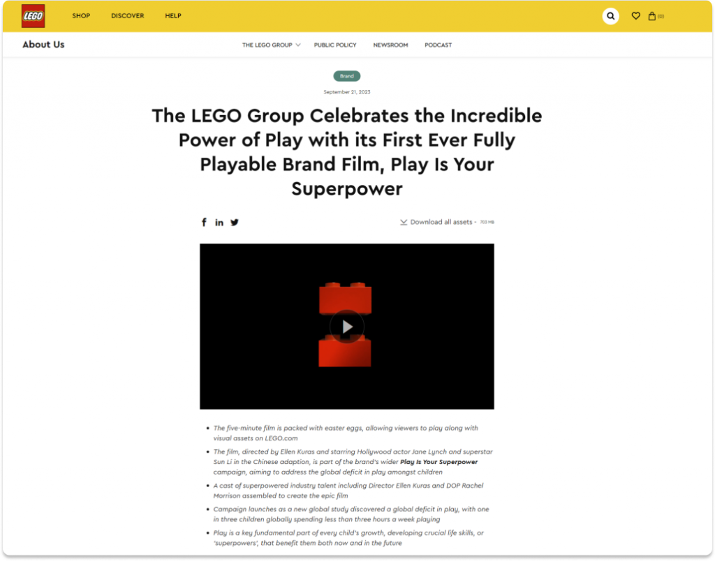
When sharing the details of their new brand film, they didn't limit the multimedia layer to the video. With stills, photoshoot effects, and a poster, they prepared a wide range of materials that can be shared along with the story.
👉For your press release template: List different multimedia ideas that can support your press release design.
P.S. You can easily add various types of multimedia with Prowly's Press Release Creator!
Press release branding
When it comes to branding, there are two major elements you can cover:
- the visual aspect, or your press release graphic design: colors, fonts, style of multimedia that you use
- communication aspect, ensuring the voice you use in crafting the message is coherent with your overall strategy
Apart from these layers, it's a good idea to show your logotype in multimedia you add. When the press release gets shared, it keeps some of the branding elements.
In some cases, it may be easier to sneak your company logo in - for example, in a product launch press release (check out our guide on them!).
Let's look at a more difficult example from Under Armour's new hire press release - talking about their new CEO.
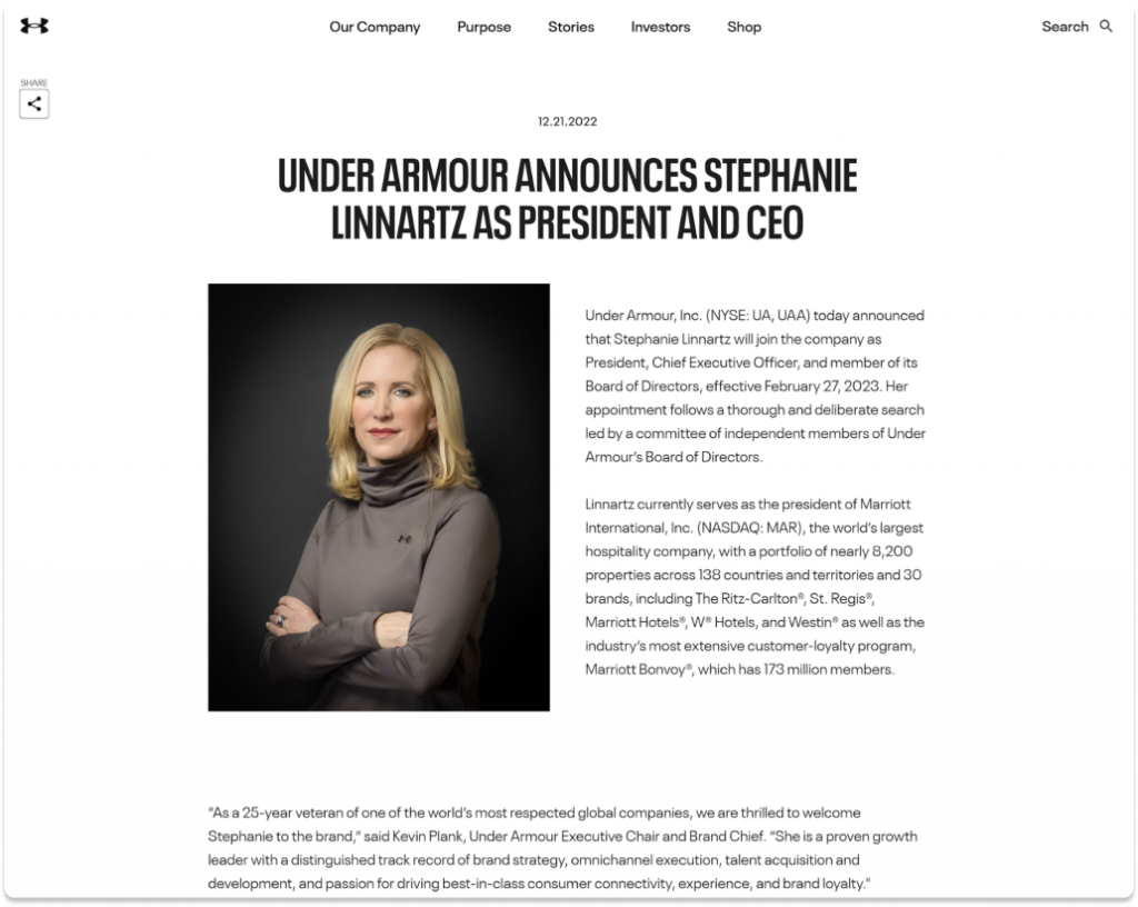
The team perfectly covers the basic layers of branding in their press release design. Both the visual layer and the sound are coherent with other press releases (like the one we covered in our article).
The most striking element of shareable branding is the photo they chose for this press release. Stephanie Linnartz, the new CEO, is photographed in a business-like, official style, yet - she's wearing an Under Armour hoodie.
That's a smart way to highlight your branding in less obvious types of press releases.
👉For your press release template: List all useful elements of branding that may come in handy.
Mobile optimization
This is nothing new: your press releases have to look as nice on mobile as they do on the desktop. And there are two main issues that journalists can face when reading your press release on mobile:
- less stable internet connection
- an interface that looks weird on a smaller screen
Of course, you won't be able to overcome these challenges entirely. But still, some design decisions that are on your plate impact the readers' mobile experience.
The size of the images you use matters when the connection isn't stable. The less data your readers have to download, the faster they can see the content. Also, for the worst-case scenario, make sure you add alternative texts. We'll cover them in the Accessibility section of this article.
Before sending your press release, check how it looks on mobile screens (ideally, a few!). You can do it right from your desktop browser - take a look at this handy guide on BrowserStack.
Be cautious, especially if you add images with text on them, as they can be cut or the text might be illegible.The easiest way to ensure all design details are taken care of is by using the right tools. For example, Prowly's Press Release Creator automatically covers both desktop and mobile versions.
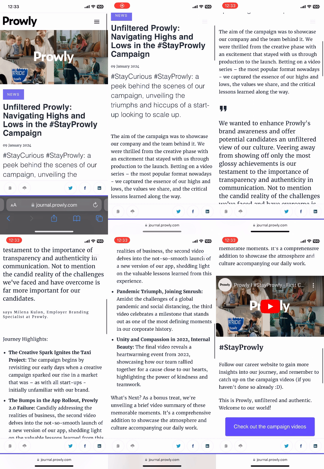
Prowly's Press Release Creator ensures you get a responsive, mobile-friendly design without the fuss of coding. All you need to do is choose the best sections (like a quote, boilerplate, title, or images), fill them with your press release content, and voilà!
When everything seems ready, you can verify the preview - and share your story with the world.
👉For your press release template: Double-check how your press release template looks on mobile.
Accessibility
This topic definitely should get more attention outside of the designers' niche. Even the most beautiful design can't be deemed as "good" if it's not accessible.
Let's talk about what's needed to successfully use online content.
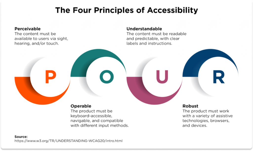
The reference point is the Web Content Accessibility Guidelines that you can access on their official page. Yet, here we'll discuss their POUR framework. It gathers the qualities that represent usable, accessible web content:
- P for Perceivable: information can't be invisible to all of the user's senses.
- O for Operable: the interface can be operated in several ways (like by mouse, keyboard, or voice assistant).
- U for Understandable: information and the operation of the user interface must be understandable.
- R for Robust: there's enough content to ensure users and assistive technologies can interpret it properly.
Let's apply these specifically to press release design:
- remember alternative texts for images, giving enough details to understand what role they play in your press release
- explain abbreviations when first used, especially if they're specific to your niche
- ensure that colors you use for text and background are of high contrast
- use hierarchy and spacing, like headings and paragraphs, to improve the structure of your press release
- when you link to other resources, describe them in the linked text (for example, "Find out more about link accessibility guidelines" instead of "Click here to find out more about link accessibility guidelines.")
These are the most important points, but it's still just a start. We strongly encourage you to learn more about accessibility, the WCAG page is a great starting point.
👉For your press release template: Prepare a checklist to make sure your press release design meets accessibility requirements.
Let's wrap up
As you can see, there are a lot of elements that you can cover as a PR specialist - even without going in-depth into the design area. When you're looking for areas to fine-tune your press release guidelines, you have just opened another door!
Incorporate these suggestions to each press release template and improve the overall quality of your releases. These simple changes can seriously boost your results!
If you're looking for more press release design inspiration, check out Prowly's resources:
- press release templates,
- press release examples (divided in categories, like new hire or product launch)
Modern PR tools like Prowly can support you through the entire flow of your PR activities. When you have your press releases ready, you can store them in your online newsroom, send them with the media database, and analyze their efficiency. And that's just a part of what Prowly brings to the table!
