It is true that in many cases the form of a text is of secondary importance compared to its content. However, after all, it is the form that allows us to grasp the message and can either turn it into a process we will enjoy or lead to a situation when trying to comprehend a text will require much of our effort. Additionally, the way a text looks can attract the eyes of prospective readers. [Read about a new press release format HERE]
Readability is something you can achieve easily
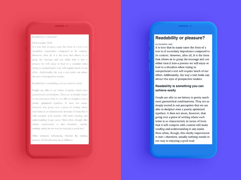
People are able to see letters in pretty much most geometrical combinations. They are so deeply rooted in our perception that we are able to decipher even a poorly optimized typeface. It does not mean, however, that going over a piece of writing where each letter is so characteristic in terms of form that it will compete with content will make reading and understanding it any easier. Most often, though, this clarity requirement is met—therefore, usually nothing stands in our way to enjoying a good read.
Other elements influencing whether the reading process will be pleasing are as follows:
- column width – it should be set in a way not to make it too wide and so our eyes don’t get lost when following lines of text;
- properly chosen color of letters – it should be contrasting enough to stand out against the background and to be easily distinguished;
- font size and spacing between lines – in online publications, it is good when the proportion of character size to the spacing between lines is larger than in the case of standard printed texts; and
- finally, well-organized text layout – assuming that a specific piece will be published online, and the website where it will be posted is responsive and the column size will change depending on the screen size—“flush left” alignment will be the safest.
How does form affect content?
The form of a text may attract attention and encourage you to read it. Also, a text that has a logical structure and lets you navigate it quickly already at the level of just looking over it may be easier to read and more enjoyable.
First, you see contrasts
The formal aspect of a text may help you channel the reader’s attention into specific important elements. To this end, most commonly used are contrasts, which are much more eye-catching than a plain-text structure.
On the other hand, the heterogeneity of elements may be problematic—if individual bits don’t seem to match, they will appear as random or poorly selected, thereby making the whole composition chaotic. However, if the distinctive elements show a recurrent pattern and follow a repetitive logic, they will help bring out the meaning and will add value to the text itself, visually making the publication simply not dull.
Text and images
The image culture is experiencing a revival. We communicate using GIFs and emoticons and more or less consciously look at hundreds of images every day. Most social media posts include graphic elements. Attracted by an image, we read, click, engage. Graphic elements in longer publications attract our attention, too, also because they are an element contrasting with text. They may be the visualization of the content and make the text seem lighter, more approachable.
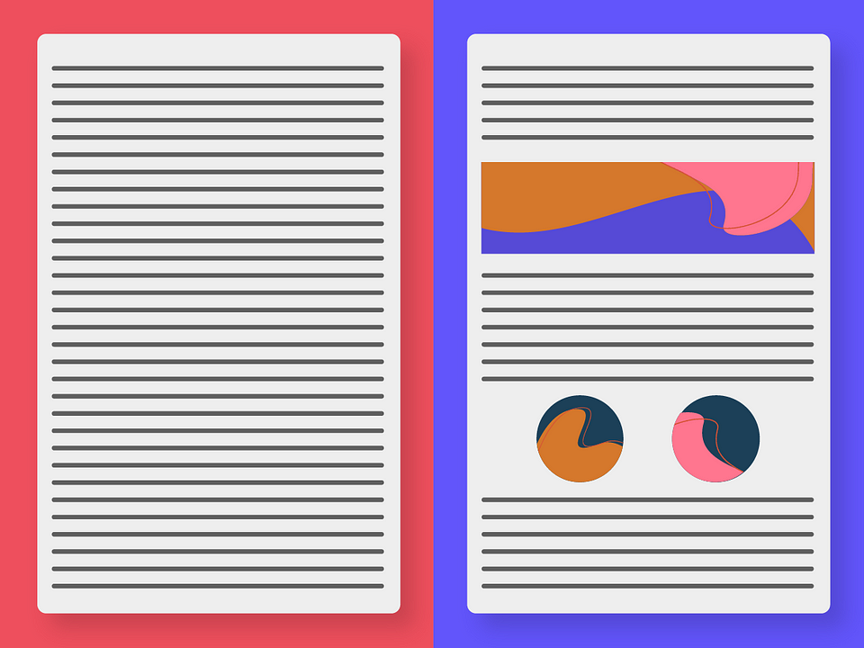
A larger, more distinguished graphic element or an image will divide the text into sections, break the monotonous typeface. As the most distinguishable element, it will be in the center of attention and highlight more important parts of a publication.
Typography pairing
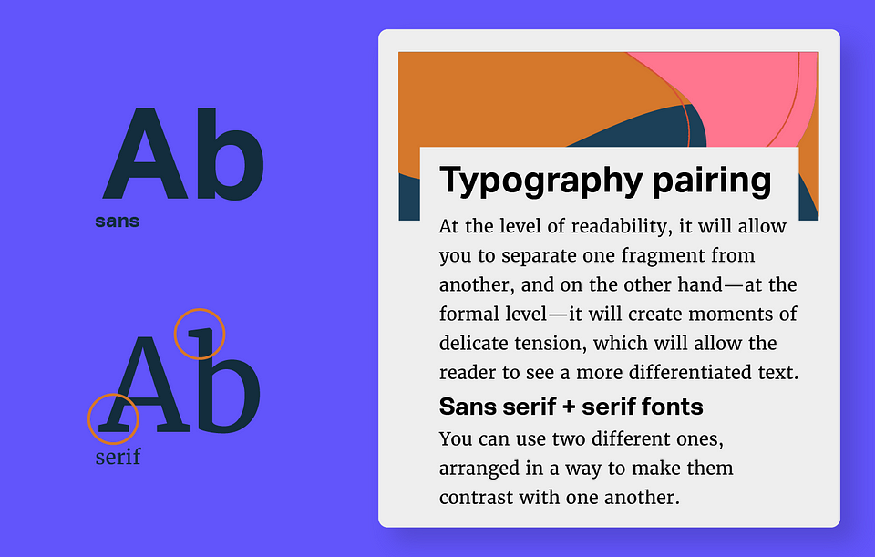
The body copy may be drawn up entirely using one typeface, or you can use two different ones, arranged in a way to make them contrast with one another. At the level of readability, it will allow you to separate one fragment from another, and on the other hand—at the formal level—it will create moments of delicate tension, which will allow the reader to see a more differentiated text.
Similarly, expressly emphasizing a quote, creating a list, or graphically displaying an extract – these will all contribute to making every line different from the one above it, thereby making it more difficult for the reader to get lost. Plus, the arrangement alone will be more attractive from the designer’s perspective.
one – two – three – four, one – two – three – four
Rhythm
If you managed to catch the reader’s eye and attract his or her interest, you must now keep this engagement, that is, create such a structure, where everything is just logical.
Visual rhythm showing certain repeatability of non-homogeneous elements calms readers down and allows them to identify the contrasting elements not as detached and out of place, but as ordered.
In printed publications, rhythm is forced by pagination, and even if it isn’t supported by other effects, it is visible. It helps to concentrate and suggests reading speed. On the other hand, in online publications, rhythm must be determined already at the drawing-up stage, and the longer the publication, the more necessary this is.
Visually separating copy elements by using a separator (e.g. a line), introducing headlines, constructing the body text using repeatable blocks (e.g. heading, several paragraphs, image, heading, several paragraphs, image)—all these tricks help to build rhythm. Similarly, more aggressive elements, such as larger graphic elements or expressly emphasized quotes—if they’re found every couple of paragraphs—will bring order to the structure. Such texts are much easier to navigate, the reader does not have to follow each line with the mouse cursor to avoid getting lost. If the reader will be able to quickly learn the scheme based on which rhythm is created, it will be easier for him or her to guess what type of information will be presented when they scroll down.
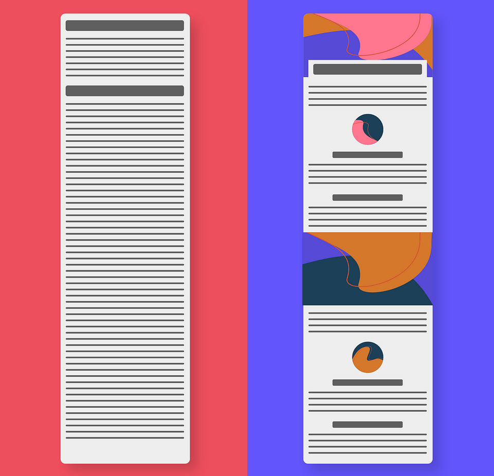
Some important and some more important things
Hierarchy
Publication’s rhythm brings order to the reading process, and the hierarchy of elements organizes the message. Most of the people will read the heading, the interested ones will read the paragraphs, while only the inquisitive readers will go through the annotations.
Formally accentuating the hierarchy of elements will simply help the reader do the reading and allow the author to bring out what he or she wants to show and hide what they must include. A text that is visually designed this way, will already at first glance seem logical. And at first glance should attract attention. Highlighted fragments (lead, quotes) outline the main message—if, at this stage, the publication will seem interesting, the reader will continue to the main part. Not everyone will read the whole thing, sometimes we only read the headlines and form an opinion based on just that. So if you can use more of those distinguishable elements to show what the author wants everyone to read, why not use this option? Additionally, hierarchy will help you build rhythm—it is the key to deciphering it. And just like rhythm, hierarchy is closely related to reading habits adopted based on reading printed publications, which are being naturally and instinctively transferred to the digital space.
***
Plain text is visually boring, monotonous, and requiring more focus. Reading a publication consisting of non-homogeneous elements, whose character helps to bring out the contrasts and whose layout helps to create a rhythm resulting from a clear hierarchy will be more intuitive. So both reading the text and looking at the form may be pleasing.
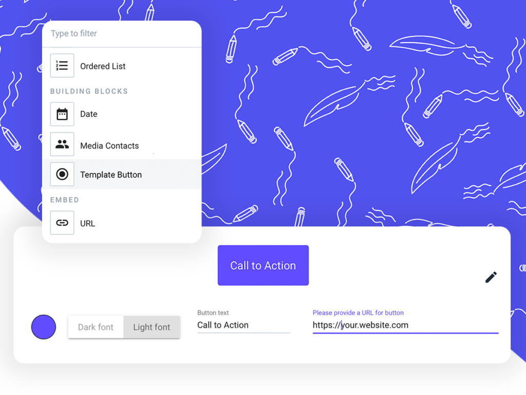
Prowly's brand-new Story Creator is working tip-top! It comes with new elements (CTA buttons), improved interface, and advanced SEO features. How does it look like in practice? Find out here.
